Ideas Post
Horror in Design: The Art and Impact of Halloween Movie Posters
Dive into the world of horror movie posters and their iconic design impact.

As autumn creeps in and the air turns crisp, the design world gets a jolt of adrenaline from one of the most captivating visual genres: horror movie posters. At Tribu, we’re enthralled by how these meticulously crafted visuals transcend simple promotion, evolving into iconic cultural symbols that shape our collective perception of fear. Let’s dive into the world of horror poster design and discover how these works of art continue to terrify and inspire.
The Power of First Impressions
For horror films, posters do more than advertise; they evoke an immediate emotional reaction. Imagine this as the film's first handshake—do it right, and it’s unforgettable. The stakes are high because, in a crowded movie marketplace, a captivating poster could be the difference between a full theater and a deserted one. This is especially true for horror films, where the poster sets the stage for terror before the audience even hits play.
Key Elements of Effective Horror Movie Posters
1. Color Psychology
Colors are not just aesthetic choices; they’re the palette that paints an emotional response. In horror design, each hue serves a distinct purpose:
- Deep reds symbolize blood, danger, and heightened tension.
- High-contrast black backgrounds add a sense of mystery and the unknown.
- Orange tones, a nod to Halloween, create a seasonal atmosphere that feels inherently eerie.
2. Typography
Fonts are the unsung heroes of horror posters, with style playing a massive role in building suspense:
- Distressed or distorted fonts evoke feelings of unease.
- Minimalist text keeps the design clean, allowing imagery to do the heavy lifting.
- Custom lettering (think “The Exorcist”) often becomes iconic, remembered long after the film leaves theaters.
3. Imagery
The right visual can send chills down your spine:
- Negative space amplifies suspense, letting the imagination fill in the gaps.
- Subtle visual metaphors, like a cracked mirror or ominous shadows, add layers of meaning.
- "Less is more" approach—when you leave out the gory details, viewers’ minds fill in the horror.
Case Studies: Icons of Horror Design
"Halloween" (1978)
The jack-o'-lantern against a black background is one of the most recognizable posters in horror. It’s deceptively simple, yet its impact is enormous. The design reflects the film’s stripped-down approach to terror, making it a staple during the Halloween season.

"The Silence of the Lambs" (1991)
A death's-head hawkmoth covering Jodie Foster's mouth creates an image that's hauntingly beautiful. The visual is powerful enough to stick in the memory of anyone who sees it, proving that a strong singular concept can resonate more deeply than any tagline.

"The Blair Witch Project" (1999)
The poster’s grainy, documentary-style aesthetic matched the film’s found-footage style, and it didn’t need elaborate visuals to generate fear. The minimalist approach sparked a new trend in horror marketing: suggest the horror without showing it explicitly.

The Marketing Impact: Beyond the Box Office
Horror movie posters extend their influence far beyond ticket sales. They become cultural artifacts, fueling discussions, sparking trends, and living on in unexpected ways:
- Social Media Engagement: The striking visuals of horror posters are highly shareable, helping spread the word and generate buzz.
- Merchandising: Iconic designs often make their way onto t-shirts, posters, and collectibles, giving fans a tangible piece of the film’s legacy.
- Franchise Recognition: A distinctive poster helps establish a visual identity that can span multiple films, creating consistency and familiarity for fans.
Lessons for Marketers: What Horror Posters Teach Us
So, what can we learn from the world of horror design? A lot, actually. The techniques used in creating these posters can easily translate into other marketing efforts:
- Evoke Emotion: Great marketing doesn’t just inform—it makes you feel something.
- Stay Consistent: Just as horror franchises maintain a cohesive look across sequels, your brand should too.
- Leverage Timing: Aligning marketing efforts with cultural events, like Halloween, amplifies your message's impact.
Evolution in the Digital Age
As digital channels become more central to advertising, horror movie posters have adapted:
- Animated posters catch the eye on social media, adding motion to already dramatic imagery.
- Interactive elements, like scannable codes leading to trailers, add an engaging touch.
- AR experiences, where viewing the poster through a phone camera brings elements to life, enhance immersion.
Conclusion
The art of horror movie poster design isn’t just about scaring audiences; it's about capturing the essence of a film and leaving an indelible mark on popular culture. Whether you’re a designer, marketer, or simply a fan, there’s inspiration to be found in the way these posters ignite our imaginations. This Halloween season, take a moment to appreciate the creativity behind these visual masterpieces—they might just give you the spark you need for your next campaign.
If you’re ready to bring some of this creative energy into your brand, Tribu can help. From bold visual identity design to dynamic campaigning-as-a-service, we’re your local advertising agency in San Antonio. Contact us to discuss how we can elevate your brand's story. Let’s make your message unforgettable.
Let's build a tribe together
Ideas, Ideas, Ideas
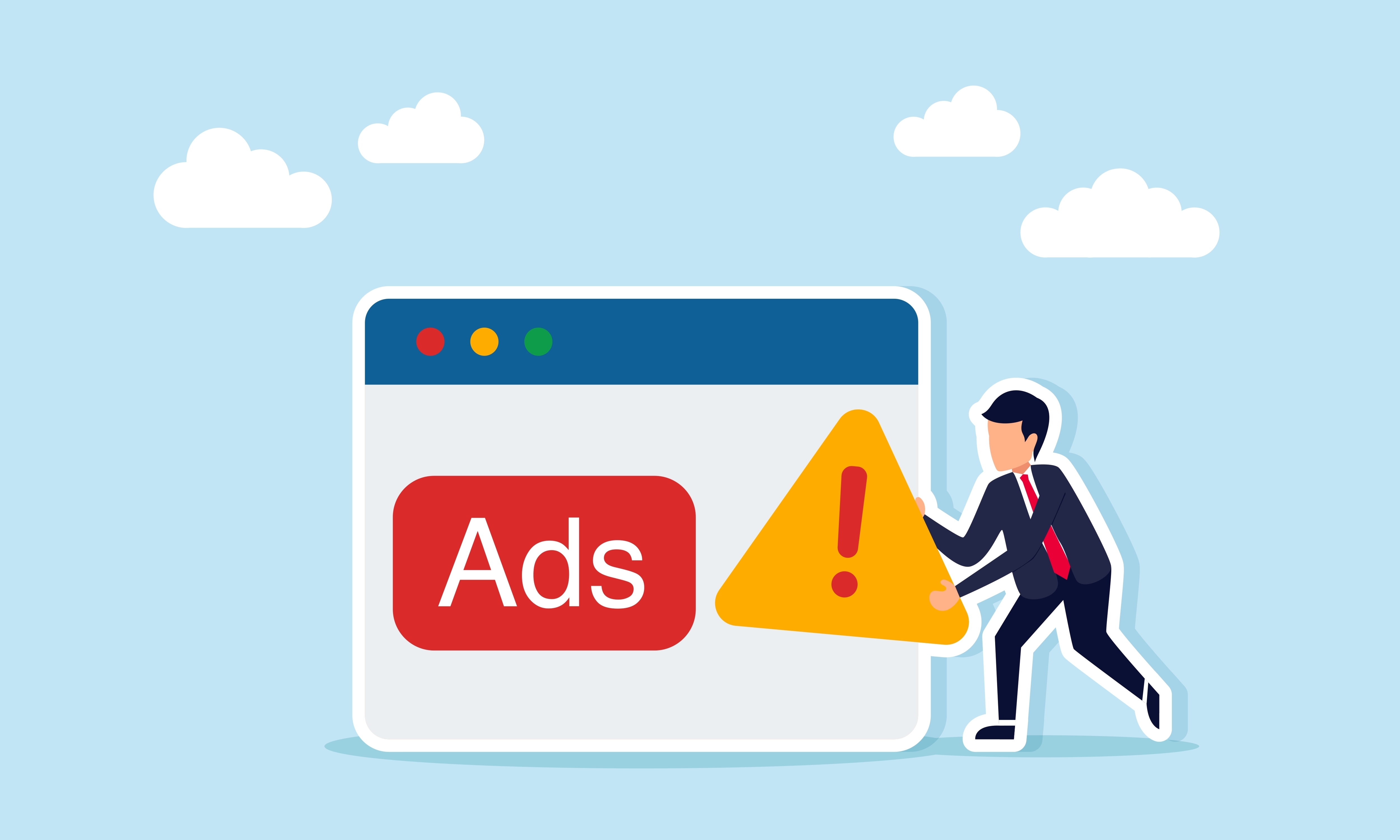
How to Battle Ad Fatigue: Keeping Your Campaigns High-Performing
Ad fatigue hurting performance? Discover how to fix it with smarter creative rotation, targeting, and testing.
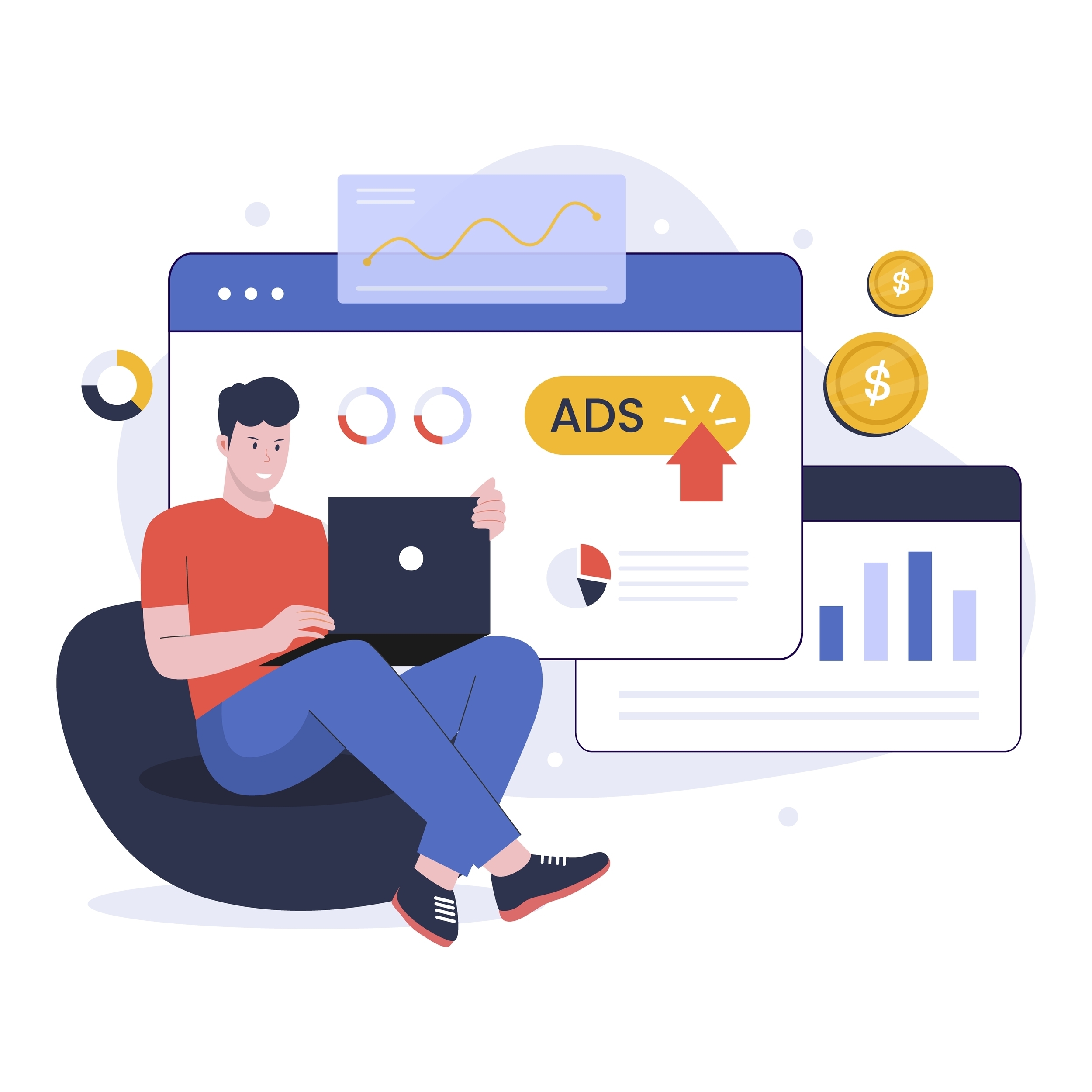
Digital Ad Metrics: What CPC, CTR, CPA, and CVR Really Mean
Break down the most important digital advertising metrics and learn how CPC, CTR, CPA, and ROAS work together.
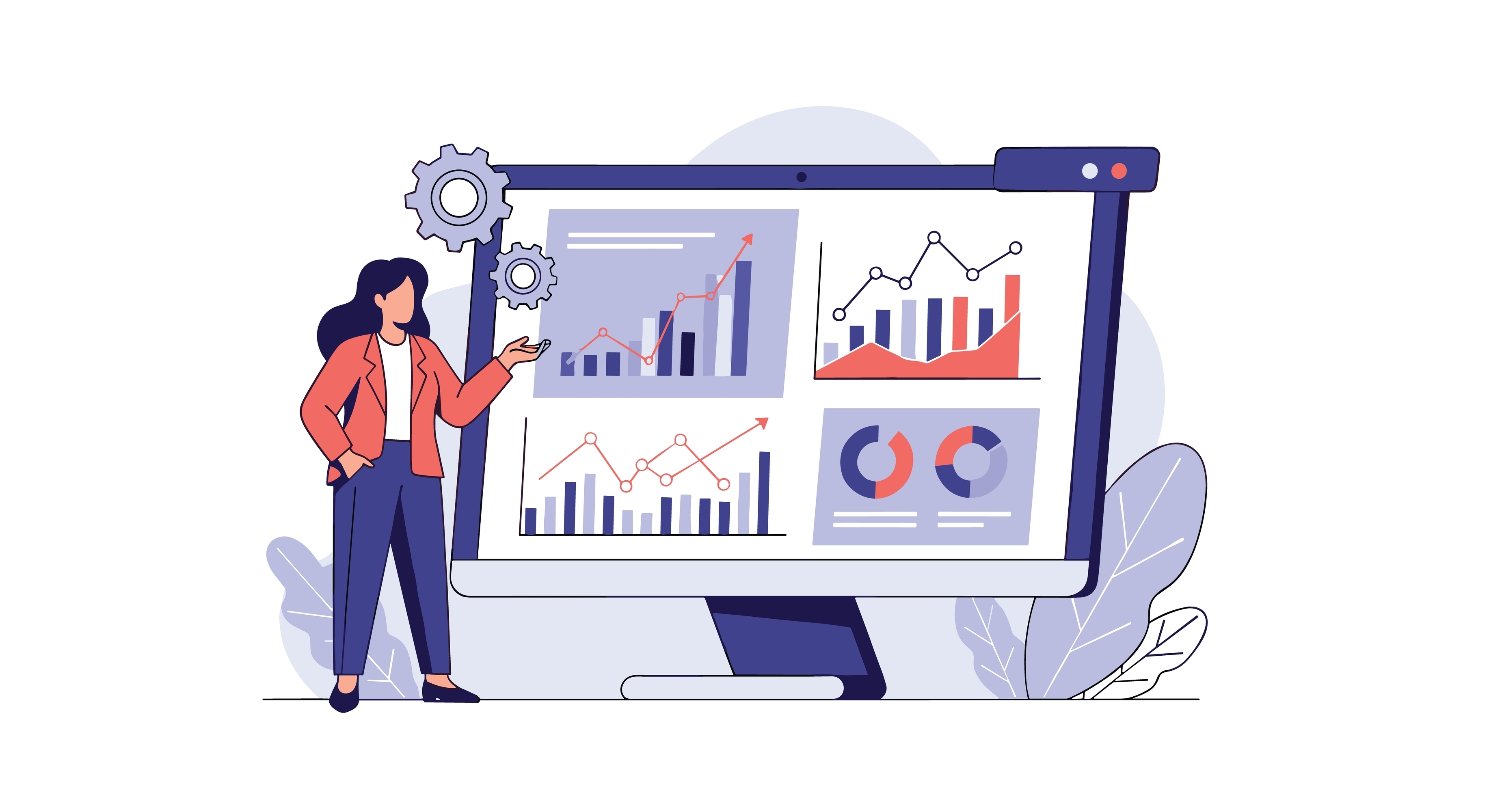
PPC vs. SEO: Finding the Right Mix for Sustainable Growth
Learn why combining PPC and organic search creates faster growth, stronger visibility, and a balanced digital strategy that works long-term.
Featured Work
We don’t just deliver - we make a difference.
Here’s a look at some of our most impactful branding, web, and campaign work. These aren’t just projects - they’re proof of what’s possible when bold ideas meet the right tribe.