Attracting attention as a marketer is crucial, and one effective way to do so is by utilizing color in your designs. Color is more than just an afterthought; it's a vital component of the design process. Discover the influence of color in graphic design in this blog and learn how to create compelling designs.
Emotion and Perception
Color in graphic design holds the power to evoke emotions and associations in people, making it a potent tool for conveying ideas and messages. For instance, blue conveys trust, calmness, and professionalism, while red emits urgency, excitement, and energy. Thus, red is often used by brands that want to create a sense of action.
Branding and Identity
Choosing the right color palette for your brand is crucial. It creates a memorable and coherent brand identity that stands out in a saturated market. To help you establish a color profile, consider your target audience, the emotion you want to bring up, and the message you want to convey. For example, for a kids' toy company logo, colorful and playful hues might be more suitable.
Readability and Accessibility
Color contrast can affect a design's readability and accessibility. Hence, it's important to ensure that your designs can be viewed and enjoyed by as many people as possible. By checking your color contrast and adhering to accessibility guidelines, you can choose the best colors for your designs.
Composition and Hierarchy
To establish hierarchy and balance in your design, use contrasting colors. You can make certain elements stand out and draw a viewer's attention. For example, a highlighted call-to-action button can boost the chances of it being clicked, while a muted background can help draw attention to the foreground elements.
Mood and Atmosphere
The colors you select will affect the mood and atmosphere you create in your design. Warm colors like red, yellow, and orange create a sense of optimism, energy, and warmth. In contrast, cool colors like blue, green, and purple convey calmness, relaxation, and tranquility. Colors are a powerful tool in graphic design that can be used to convey emotions, establish branding and identity, enhance readability and accessibility, set composition, and establish mood and atmosphere. By integrating colors with mastery, you'll create more than just aesthetically pleasing designs - you'll communicate ideas and messages effectively.
Let's build a tribe together
Ideas, Ideas, Ideas
How Social Media Advertising Is Changing in 2026
Discover how brands can adapt to emerging social platforms with content that feels native, useful, and audience-aware.

The Problem With “Our Audience Is Everyone”
See why specific audience insight leads to sharper messaging, stronger creative, and more effective marketing.

AI Made Marketing Content Faster. It Didn’t Make It Better.
Explore how AI changed content marketing and why strong strategy still matters more than speed or volume.
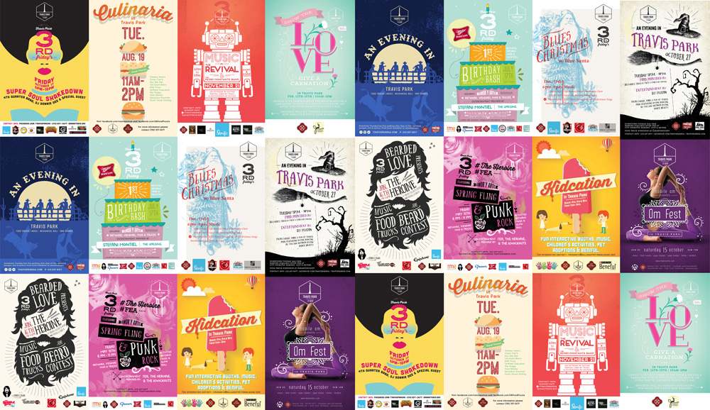
Featured Work
We don’t just deliver - we make a difference.
Here’s a look at some of our most impactful branding, web, and campaign work. These aren’t just projects - they’re proof of what’s possible when bold ideas meet the right tribe.