Ideas Post
The Do’s and Dont’s of Website Design

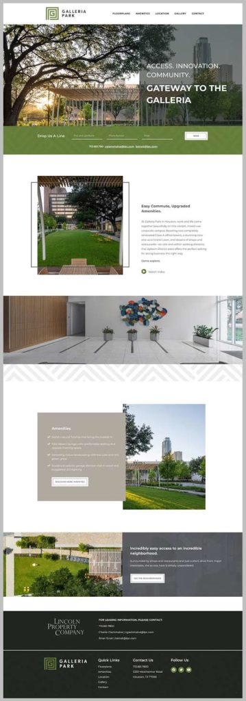
In this blog, we are going to take a look at some design and functionality decisions made in the homepage redesign of Galleria Park. Why the homepage? It is important to get the homepage right because it is going to set the tone for the rest of your website. If the homepage feels unorganized, cluttered, or dull, it is likely that the user will be overwhelmed and hesitant to explore the rest of your site. Use these Do’s and Don’ts as a guide when designing your next website.BEFORE

BEFORE
Do’s
- Do use a clear and consistent grid.
A grid is like an invisible skeleton that your design should anchor to. You can also think of a grid as a coloring page, keeping your designs inside the lines. To keep the grid more consistent in this design, we expanded several sections to be the full width of the page just like the footer section in the “before” design.
- Do use white space.
White space can help your homepage feel fresh and uncluttered. It is important to let your content breathe so users can easily navigate and read through the site. We improved this page by adding more white space around content and images. When you have great images, don’t crowd them with other overlapping images or text.
- Do use bright and welcoming headers.
First impressions are important! The header is the very first thing a user sees when visiting your website, so it should be bold and bright. Use impressive imagery and if you must use a transparent background make sure it does not drown out the image. We improved this header section by making it bigger, adding an image slideshow, and we used the transparent background in a more purposeful way.
- Do use animations throughout your website.
Animations are fun and can bring more excitement to any website. This new website has a slideshow of images in each header, parallax sections, and images that come in from off of the page. Keep your user interested by surprising them with animations!
Dont’s
- Don’t make the user work for it!
Make the navigation easy to use by clearly stating the different pages of your website. In this case we changed the navigation from “Inside” and “Outside” to simply “Amenities”. Now the user can find all the amenities on one page.
- Don’t break the grid.
Keep your designs inside the lines! Make sure all the content and design elements on your page are anchored together. In the “before” version of this site, you can see that some elements go beyond the grid and appear to be floating away rather than help draw attention to what is really important - the content!
- Don’t overcomplicate the footer.
If you have more than one footer section make sure they are separate but equal. Do this by making the logos equal sizes and align the typography. If you wish to have them separate, change the background to a lighter or darker hue. In this case the two footers are separated by a small gap and a pattern overlay on one section and not the other.Looking to redesign your current website? Contact us today!Contact us
Let's build a tribe together
Ideas, Ideas, Ideas

The Role of Empathy in Modern Marketing
Attention spans are shrinking and algorithms shift faster than brand loyalty—what truly cuts through the noise in modern marketing isn’t just strategy. It’s empathy.

TikTok Made Me Buy It: Why They Have The World's Most Addictive Ads
What makes TikTok ads so irresistible? Why do we go from scrolling to swiping our cards in seconds? And more importantly, what can marketers learn from that?Let’s break down why TikTok's ad strategy is the most addictive on the planet.

The KPI Dilemma: Are Likes Leading You Astray?
It’s tempting to chase what’s visible. We all love a good screenshot of “likes blowing up” in the group chat. But growth doesn’t always look like applause. Sometimes, it looks like a quiet uptick in qualified leads. A steady climb in average order value. A new stream of referrals.
Featured Work
We don’t just deliver - we make a difference.
Here’s a look at some of our most impactful branding, web, and campaign work. These aren’t just projects - they’re proof of what’s possible when bold ideas meet the right tribe.


.gif)