Ideas Post
The NFL’s Top 5 Logos

Everyone that knows me knows I love football.I love everything about it – the epic, theatric-like three-hour length, the human drama, the coaching chess match, the heroes, storylines, and tragic downfalls – there is nothing like it in the world.For this month’s blog, I figured what better way to celebrate football’s return than a post exploring one of my favorite topics –what NFL team has the best logo?!Without further ado, my ranking of the top 5 logos in the NFL.For reference, here’s a picture of all 32 NFL teams’ logos, so you know the pool I’m selecting from:
5) The Denver Broncos
I’m not normally big on “new” logos (my definition of ‘new’ is anything released post 1980). But the Denver Bronco’s now 21-year old Bronco made my cut:
It’s just so powerful – the beautiful “orange crush” color of Bronco’s mane, its intense eyes, all the angles flowing forward… beautiful.I also think it does an amazing job of conveying Colorado’s Rocky Mountains and the rough and rugged individualism of the America’s great frontier.
4) The Green Bay Packers

I have to give credit where it’s due, the Green Bay Packers’ 58 year old iconic “G” is a beauty. What makes it so great is how timeless it is – it’s just a “cool” mark that transcends any era.Like the Broncos’ logo, it also does an awesome job of conveying sustained, confident, and classy power.
3) The San Francisco 49ers

What a beauty. Just like the Packers – timeless, classy, confident, and cool. Bonus points for its’ bold overlapping of the “S” and “F,” a risky maneuver to pull off in theory, but is pulled off so well.I love how it kind of looks like Superman’s emblem too. The gold edging as well, paying homage to California’s great Goldrush of the mid-1800s, is an amazing touch – how the edging’s width changes with the curvature of the logo is perfect – striking that perfect balance of grit and class.
2) The Pittsburgh Steelers

Give me the Steelers here. What a totally unique and historic logo – the emblem was originally (and still is) owned by the American Iron and Steel Institute and was adopted by the Steelers in 1962. It hasn’t changed since.Yellow, red, black, and blue together is a bold, rarely seen combo. I like how the ‘Steelers’ font to the left totally screams 1960s – connating calm, cool, and collected. The “diamond” like emblems are ultra cool as well – portraying a beautiful, yet masculine look.
1 ) The Dallas Cowboys
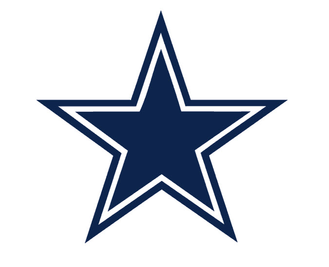
This one wasn’t hard to choose. The Dallas Cowboys simply are America – they’re Roger Staubach, Tony Dorsett, Danny White, Troy Aikman, Emmitt Smith, Michael Irvin, and Tony Romo. They’re the Dallas Cowboy Cheerleaders, Tom Landry, and Tex Schramm.To me, they’re Captain America – the organization with colors impossible to hate – Navy Blue, White, and Silver. It just doesn’t get any more “4th of July” than the Dallas Cowboys, sorry Patriots.All fan-boying aside, the Dallas Cowboys logo rocks. It’s simple, confident (that white border) and heroic. It’s simple yet charged with history and heroics. It’s America, baby.
We can’t wait to generate this type of report for your brand- drop us a line or give us a call
Let's build a tribe together
Ideas, Ideas, Ideas

The “More Content” Trap: Why Content Strategy > Volume
When things slow down, the instinct is to crank up the content. But here’s the truth: more doesn’t always mean better.

The Role of Empathy in Modern Marketing
Attention spans are shrinking and algorithms shift faster than brand loyalty—what truly cuts through the noise in modern marketing isn’t just strategy. It’s empathy.

TikTok Made Me Buy It: Why They Have The World's Most Addictive Ads
What makes TikTok ads so irresistible? Why do we go from scrolling to swiping our cards in seconds? And more importantly, what can marketers learn from that?Let’s break down why TikTok's ad strategy is the most addictive on the planet.
Featured Work
We don’t just deliver - we make a difference.
Here’s a look at some of our most impactful branding, web, and campaign work. These aren’t just projects - they’re proof of what’s possible when bold ideas meet the right tribe.


.gif)


