Ideas Post
What is the Retro-futurism Design Trend? And Should You Use It?
Wondering what retro-futurism design is and if it's right for your brand? This article breaks down everything you need to know, including examples of successful brands who've used it.

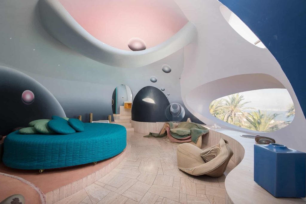
What I have seen recently is a growing trend called “retro-futurism”. You probably have seen this most noticeably in packaging design with nostalgic elements. Used in a modern twist or with an edgy-looking logo with sci-fi elements next to some kind of strange-looking marble bust. What does all this imagery mean and should you use it in your designs? First, let's define. If you were a person of the past think about what the future would look like and draw a picture. As a result, your picture would be defined as “retro-futurism”. It is a contemporary way of looking at the future with the anticipation of what science, technology, and design would look like. This has been a movement of the past and is referenced many times for inspiration. I personally love looking at retro-futuristic interior design with curvy loopy shapes with modern materials. It's exciting to see a juxtaposition between new and old. The other major component of this movement is using traditional imagery with modern materials.


Now should you use this design trend? It depends, does your client want to explore nostalgic ideas or explore ideas of current trends in technology? If yes, then this trend might be beneficial to your work. A great example of this is making a poster about the crazy new artificial intelligence that is being used in the creative space in a positive or negative light. A lot of “sub” categories of retro-futurism also have their tones. Cyberpunk is one of the pillars of retro-futurism. Just a more dysfunctional take on technology. Using elements of glitching and digital artifacts makes the viewer feel like they are interacting with technology that might shut down on them at any moment. My favorite example, if you like video games, is Cyberpunk 2077. I'm currently playing it and I'm enjoying seeing all the nuanced details. The design team did a great job using this style to drive the dystopian tone around the game. The look is gritty but still clean. Using neon to relate to the 80’s synth style as well as using modern san serif fonts that envision a technologically advanced future. While occasional glitches animate and simple 3D rendering display in front of me making me feel that even though this world is advanced the culture around it has devolved into chaos.


Another subgenre of retro-futurism is “vaporwave”. This one is similar to the cyberpunk aesthetic but influenced by the Y2K look and early 90’s culture and technology. Saturated colors influence the emerging internet with hits of the Windows 95 web browser interface.


I am excited to see more of this trend especially since our current real-world technology is not going away any time soon. It is only going to get crazier and more advanced.
Let's build a tribe together
Ideas, Ideas, Ideas

TikTok Made Me Buy It: Why They Have The World's Most Addictive Ads
What makes TikTok ads so irresistible? Why do we go from scrolling to swiping our cards in seconds? And more importantly, what can marketers learn from that?Let’s break down why TikTok's ad strategy is the most addictive on the planet.

The KPI Dilemma: Are Likes Leading You Astray?
It’s tempting to chase what’s visible. We all love a good screenshot of “likes blowing up” in the group chat. But growth doesn’t always look like applause. Sometimes, it looks like a quiet uptick in qualified leads. A steady climb in average order value. A new stream of referrals.
Featured Work
We don’t just deliver - we make a difference.
Here’s a look at some of our most impactful branding, web, and campaign work. These aren’t just projects - they’re proof of what’s possible when bold ideas meet the right tribe.


.gif)


