EcoSmart Solution is a Joint Venture of global real estate investment firm, Taurus Investment Holdings (TIH) and Shell New Energies, a subsidiary of global energy leader Royal Dutch Shell. They combined new technologies and industries to create an eco-friendly living solution at an affordable cost. Our team loved working on Ecosmart as we gave them a head-to-toe rebrand.
Sometimes simple is the way to go.
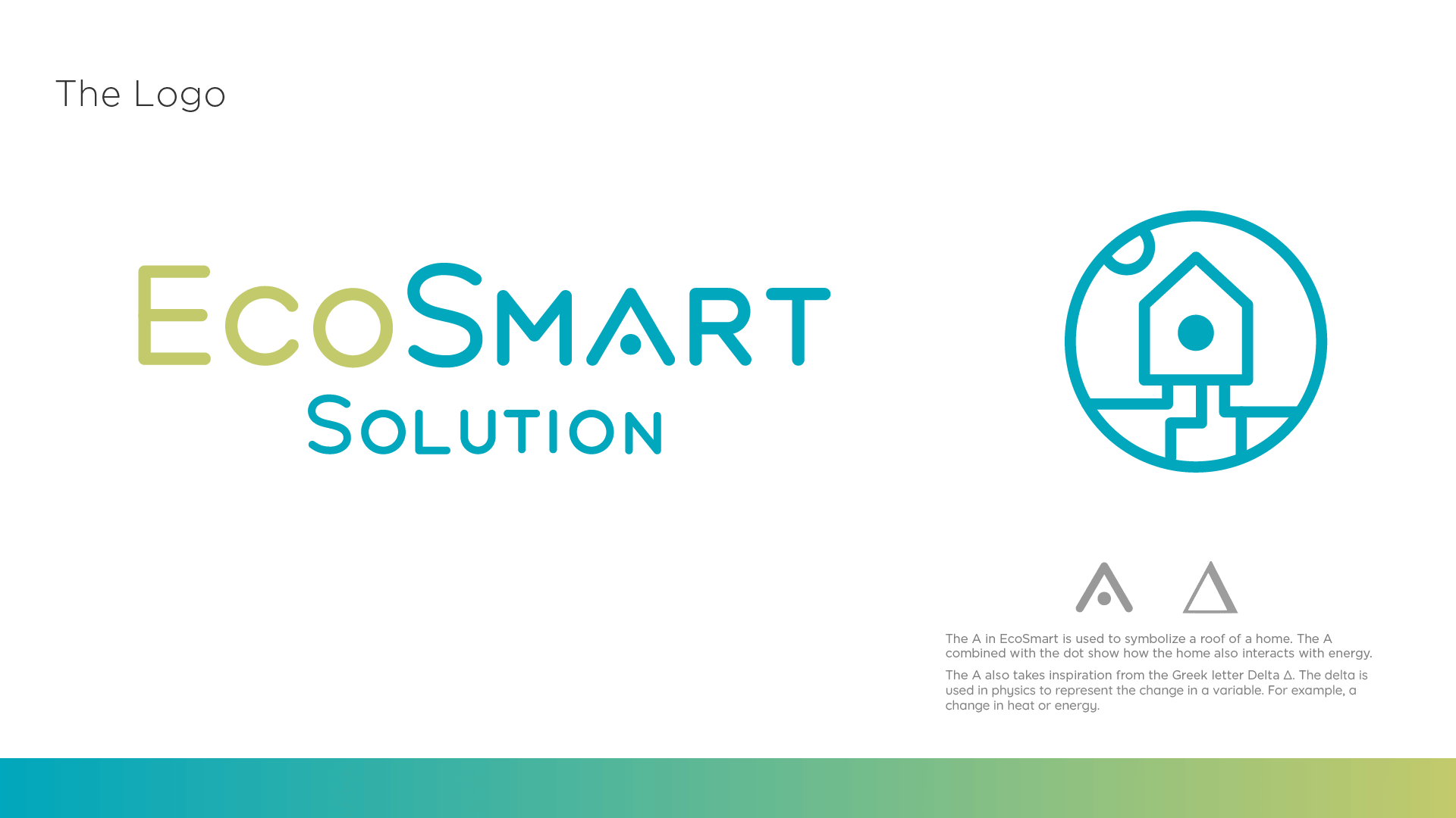
Starting with the logo we decided to reflect the features used in an EcoSmart home. Using the sun to show solar and show a pipe grid to reflect the GeoGrid. We created a custom typeface for Ecosmart to match the illustration style we developed.

The dot is a unifying element used in the icon and in the typeface It also symbolizes energy and a molecule of heat or a photon of light. EcoSmart uses thermal and solar energy to create an eco-friendly lifestyle.

The A in EcoSmart is used to symbolize the roof of a home. The A combined with the dot shows how the home also interacts with energy. The A also takes inspiration from the Greek letter
Delta Δ. The delta is used in physics to represent the change in a variable. For example, a change in heat or energy.
Because Ecosmart uses new technologies we wanted to display it through animations. Everyone benefits from images and animations to help explain information and ideas we had so much fun exploring animations. Animation can even show personality depending on how it is animated. Smooth and calm animations give a welcoming feeling for all.
We used animations everywhere. Form complex animation showing technology in use in a home during seasons to smaller animations like an animated gradient to show energy and heat transfer.
https://youtu.be/-WCLb3FSqH8
The color was important. We wanted EcoSmart to stand out from among others and be bright and welcoming to all who wanted to learn more about EcoSmart Solution and the technologies used. Using these colors help capture the fun and eco-friendly qualities of EcoSmart. The eco-friendly lifestyle is represented by blue and green. While the warm colors represent warmth, heat, and energy.

We developed a fully modular pattern to complement the logo style and to illustrate and explain the technologies used. We use our patterns to show the interconnected technology used in EcoSmart communities. The illustration style allows for flexibility to create new illustrations for any new infographic needed for explaining new technologies.

Let us bring your brand to life. Seriously, it's what we live for. Contact us, pronto!


