


CSS is extremely useful when you just need a simple animation and don’t want to dive into JavaScript. In this article we will introduce you to key concepts and the basic structure of CSS animation.
Keyframes
The first step in creating CSS animation is to declare your @keyframes rule. The @keyframe rule is how you control your animation from beginning to end.
Below I have created an animation called ‘example’.
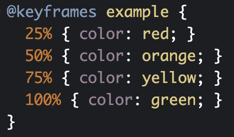
Once @keyframe ‘example’ is declared, we use percentages to control the animation. 0% is the beginning, while 100% is the end of the animation.
Within this step we also need to specify what property we will be animating. In ‘example’, we will be animating the color of some text from red to orange to yellow and then to green. There’s no need to worry about the transitions, CSS will take care of that for us.
Attaching the Animation to an Element
Once a @keyframe rule is declared, it can be used by any element on the page. We’re going to be using it with an <h1> tag.
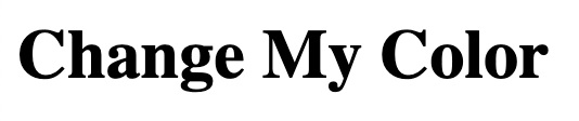
The <h1> tag we are animating
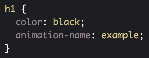
In order to use our animation on the <h1> tag, we need to use CSS to set the animation-name property to have a value of ‘example’.
Customizing
There are eight animation properties used to customize your animation within CSS:
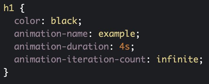
If we want our animation to take 4 seconds to complete and repeat continuously, our CSS would like this:
And our animation would look like this:
Easing
The last concept we’re going to look at is easing. Easing is used to create a more natural animation.
To specify the type of easing we want to use, we need to set the animation-timing-function. Some of the values that can be used are:
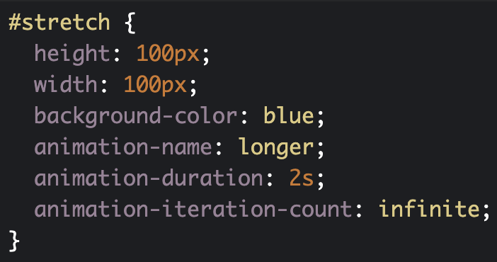
To see how this works, we will create a new div with and id of ‘stretch’ and set the CSS values to the following:
Now let’s set the animation-timing-function property to ‘linear’ to see the difference.
Using ‘linear’ causes the animation to maintain one speed throughout the entirety of the animation. Linear animations tend to feel robotic and are best to be avoided.
Conclusion
Now that you know the basics of CSS animation, it’s time to go play around with some code. You can create your own or feel free to play around with our CodePen
Like our work?
Contact us and let us make your project shine!
Tribe up your inbox and keep up with Tribu

Discover how treating creativity as a muscle that needs regular exercise and varied stimulation can help keep it in top shape. Learn how to build visual fluency, tackle new challenges, manage fatigue, explore uncharted territory, generate innovative ideas, and forge novel syntheses.

Discover how to create visually compelling social media content that resonates with your audience. Learn the key elements of effective social media design.

Discover the latest and most exciting web technologies with our new blog series, the Monthly Tech Spotlight. Learn how to elevate your online presence with Lottie Animations, Spline, and more.


.gif)


210.209.9209
hello@wearetribu.com
420 Milam
San Antonio, TX 78202
The Work
Services
About Us
On Our Minds
Careers
Contact Us
Stay up to date with the latest from our Tribe, celebrate achievements with us, and soak in new marketing insights.